01 | ChangE Cookhouse | Part 1 Logo Design
- jbeansgdd
- Jun 8, 2022
- 2 min read
Updated: Jun 11, 2022
Let ideas build off other ideas. After all, there's nothing more fitting than to witness the logo transformation of a brand named change.

The client:
Cafe owners who specialise in traditional Chinese food with a modern twist.
Today's task:
Draft a logo!

The Process
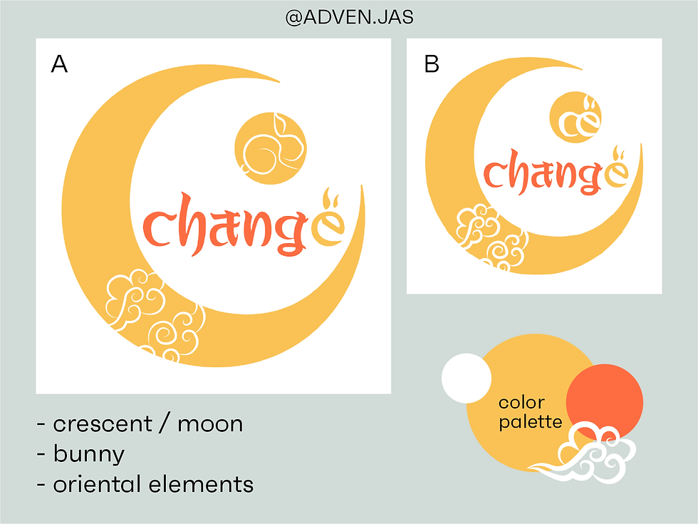
Taking inspiration from the moon goddess Chang'e, I started off with the idea of using a crescent moon as the centrepiece of the logo. An added bonus was that a crescent well...looks like the letter 'C'.
So we have i) moon, ii) bunny, iii) oriental elements as a start. I did a line sketch of the bunny in the moon - that was before I realised hey! I can use the initials ‘C’ and ‘E’ to form a bunny!
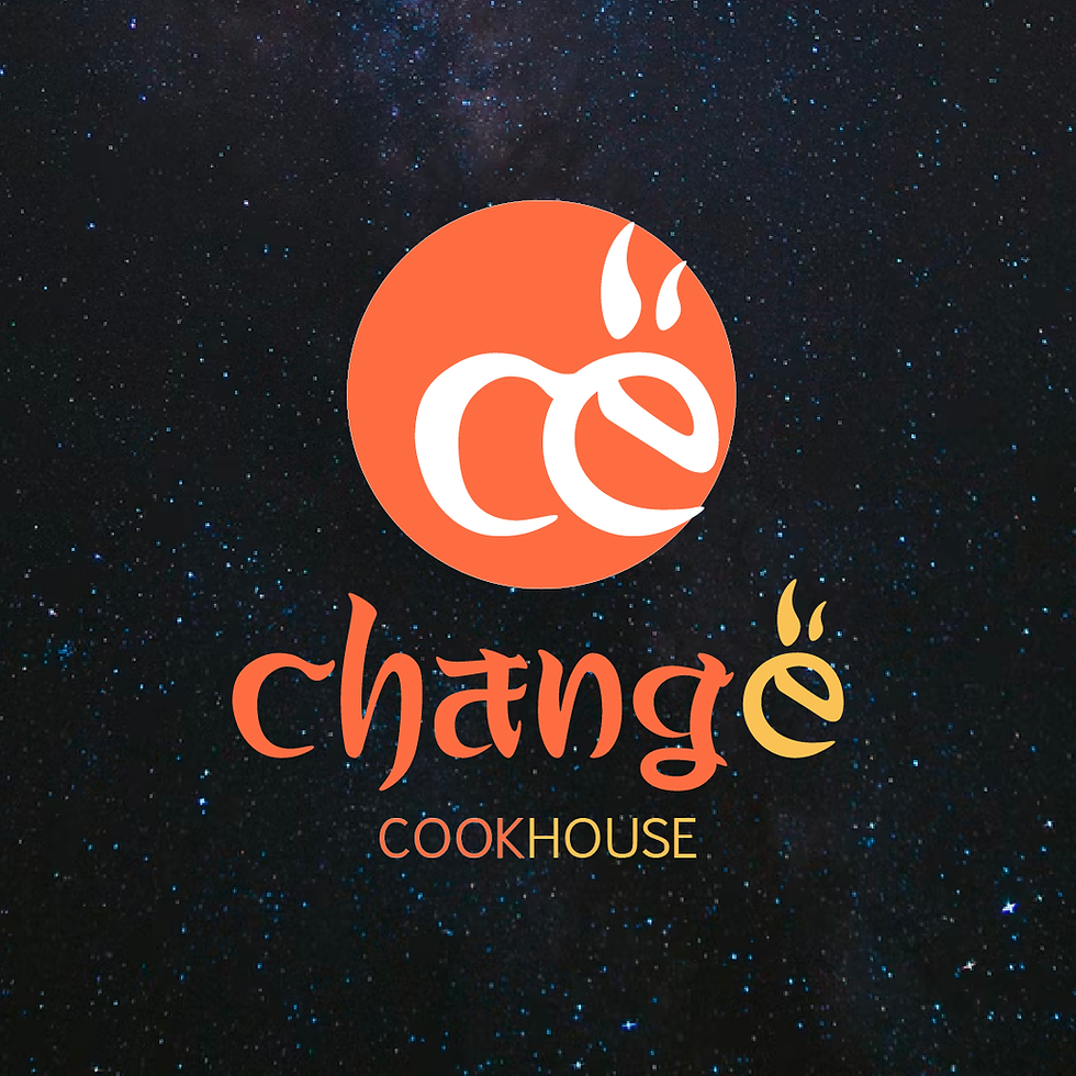
With the newly-birthed bunny, our crescent moon was now kinda redundant. The circle our bunny resided in called to mind a full moon, and the brand initials are well-represented. All boxes checked!
Removing the crescent made the logo a lot cleaner. The little bunny ears on the ‘E’ looked a bit like flames as well - don’t you think? Seems very appropriate for a cookhouse!
I quite like my final draft - but let’s play the devil’s advocate here. How would I improve it?
could i have made the moon look more like a moon? was it the color used? perhaps addition of clouds might work?
the shade of orange reminds me of a lantern! the circle could be transformed into a lantern - making the association to the brand being a Chinese food-centric one stronger.
should i have introduced elements that will point to the brand being an F&B establishment?
what i’ve learnt: let ideas build off other ideas! through this exercise, it became clear to me that during the creative process, i may end up with something that looks completely different from what i first envisioned...but that’s also where the magic is at! without that initial idea as a stepping stone, we wouldn’t have gotten to the end result - it’s really about trusting the process.
It was a pity I had to scrape the crescent, but I’m sure I’ll get to incorporate it into other areas...like brand collaterals!
I also finally learnt how to convert text to vectors in Illustrator - which turned out to be ridiculously simple. Just:
select your text
click “Type” from top menu
click “ Create Outlines”
That’s all from me for this very first task. How would you have done it?
‘til our friendly fictional clientele assigns us another task! 👋


Comments